
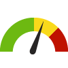
Indicator Gauge Icon Legend
Legend Colors
Red is bad, green is good, blue is not statistically different/neutral.
Compared to Distribution
 the value is in the best half of communities.
 the value is in the 2nd worst quarter of communities.
 the value is in the worst quarter of communities.
Compared to Target
 meets target;
  does not meet target.
Compared to a Single Value
 lower than the comparison value;
 higher than the comparison value;
 not statistically different from comparison value.
Trend

 non-significant change over time;
 significant change over time;
  no change over time.
Compared to Prior Value
 higher than the previous measurement period;
 lower than the previous measurement period;
 no statistically different change from previous measurement period.
 Significantly better than the overall value
 Significantly worse than the overall value
 No significant difference with the overall value
 No data on significance available
Age-Adjusted Death Rate due to Cancer
Measurement Period: 2019-2021
This indicator is archived and is no longer being updated. Click to learn more
This indicator shows the age-adjusted death rate per 100,000 population due to cancer.
Why is this important?
The National Cancer Institute (NCI) defines cancer as a term used to describe diseases in which abnormal cells divide without control and are able to invade other tissues. According to the NCI there are over 100 different types of cancer, but breast, colon, lung, pancreatic, prostate, and rectal cancer lead to the greatest number of annual deaths. Risk factors of cancer include but are not limited to: age, alcohol use, tobacco use, a poor diet, certain hormones, and sun exposure. Although some of these risk factors cannot be avoided--such as age--limiting exposure to avoidable risk factors may lower risk of developing certain cancers.
The Healthy People 2030 national health target is to reduce the overall cancer death rate to 122.7 deaths per 100,000 population. County: Marin
105.6
deaths/ 100,000 population
Source:
California Department of Public Health
Measurement period: 2019-2021
Maintained by: Conduent Healthy Communities Institute
Last update: August 2023
Measurement period: 2019-2021
Maintained by: Conduent Healthy Communities Institute
Last update: August 2023
Compared to

Technical note: Data compiled by CDPH using the California Comprehensive Master Death Files.
Graph Selections

Data Source
- California Department of Public Health
Maintained By: Conduent Healthy Communities Institute (Methodology)
Filed under: Health / Cancer, Health / Mortality Data, Health Outcomes, Women